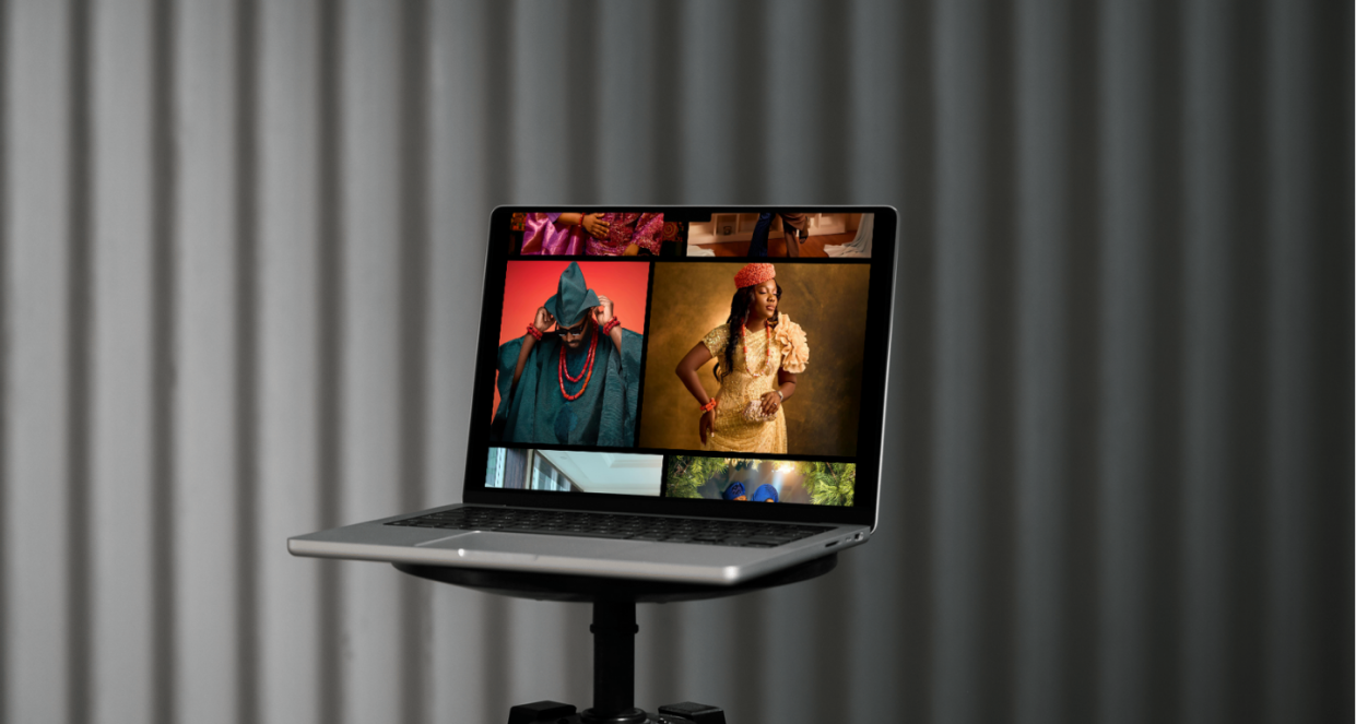
Website Design for Goldlenses City
Showcasing Excellence and Inspiration Through an Elegant Digital Experience

Introduction
Gold Lenses City, founded by Wura Oyeniran, is a premier photography studio that aims to inspire through a unique lens. The studio caters to clients who value excellence and are drawn to one-of-a-kind photography. As the studio looked to expand its reach and connect with a wider audience, they turned to Hypeverve for a website that would capture their essence and allow visitors to explore their work and purchase exclusive, inspirational frames with ease.
Services
Audits & Analysis
Strategy
Brand Identity Design
Web Design
Web Development
The Challenge
Gold Lenses City needed a website that could:
- Showcase Their Portfolio: Prospective clients needed a way to experience Gold Lenses City’s portfolio online and understand their commitment to quality.
- Sell Inspirational Frames: The studio wanted an e-commerce functionality where clients could easily browse and purchase frames that would add a personal touch to their spaces.
- Embody Their Brand Identity: A sleek, sophisticated look in black and gold would be essential to reflect their values and connect with an audience that “doesn’t settle for less.”
The Solution
To meet Gold Lenses City’s needs, Hypeverve designed a visually captivating website using a dark theme with touches of gold. This design choice aligned with the client’s luxurious brand and highlighted the richness of their photography.
Key Features of the Website:
- Homepage with Stunning Visuals: The homepage opens with impactful imagery that captures the spirit of the studio, allowing potential clients to experience their work’s quality from the first click.
- User-Friendly Portfolio Gallery: The gallery section is organized to help visitors easily browse Gold Lenses City’s portfolio, immersing them in the unique and inspirational moments captured by the studio.
- Integrated E-commerce Shop: A dedicated shop page simplifies the purchase of Gold Lenses City’s custom frames, enabling users to order frames effortlessly. This feature meets the client’s core requirement for ease in ordering frames, enhancing the site’s usability.
- Simple, Sophisticated Typography: We used Reckless Neue for headings and Figtree for body text, combining elegance and readability, which aligns with the studio’s aesthetic.
- Blog Section for Inspiration and Insights: A blog section offers insights into photography and the studio’s philosophy, connecting with their target audience on a deeper, more personal level.
- About Page and Contact Information: These sections add a personal touch, sharing the story behind Gold Lenses City and offering easy ways for visitors to get in touch.


The Result
The new website provided Gold Lenses City with a digital platform that mirrors their premium and inspirational brand. The black and gold color palette lent the site a luxurious, polished feel, making it an ideal backdrop for their photography. The user experience was crafted to be smooth and intuitive, particularly in the shop, where clients can now easily order frames with just a few clicks. This refined digital experience positions Gold Lenses City as an elite photography studio with an online presence that inspires and engages.
Balancing her desire for a joyful, colorful presentation with a structured, strategic message that conveyed purpose and professionalism was essential to this project’s success.


Jacqlene Monet
Public Speaker, Narrator, and CEO JM Legacy
Client Feedback
Hypeverve perfectly captured the essence of Gold Lenses City with this redesign. The black-and-gold theme brings a luxurious feel, and the gallery and shop are both easy to navigate. Our clients now get an inspiring, seamless experience that matches our brand. I’m thrilled with how it turned out.
Wura Oyeniran
CEO, Creative Director Goldlenses City
Ready to take the next step?
Let’s create a digital presence that truly represents you and captivates your audience.
